
In case you hadn’t noticed, Mobilegeddon is upon us. Unlike a regular armageddon with explosions and cataclysms, Mobilegeddon is the quiet meltdown effect of Google’s new algorithm upon your website, should it not be optimized for smartphones.
The almighty Google has been warning users and developers for years that we must get on the mobile bandwagon. That’s because the use of smartphones to surf the web has exploded beyond belief, and the beneficent Google wants to insure everyone a great experience online.
In February, Google decreed that webmasters had to get their sites optimized for smartphones by April 21, or else they could expect a drop in rank. Three weeks later, the time of reckoning is upon us.
So, is your site Mobile Friendly?
Test your optimization
 How do you know if your site is optimized for smartphones?
Quick way: On your desktop, grab the browser window on the bottom right corner and drag it to the left until it’s a vertically shaped window.
Did the page elements shrink or did they rearrrange themselves to stay the same size? If they stayed still and shrank, your site is NOT mobile friendly
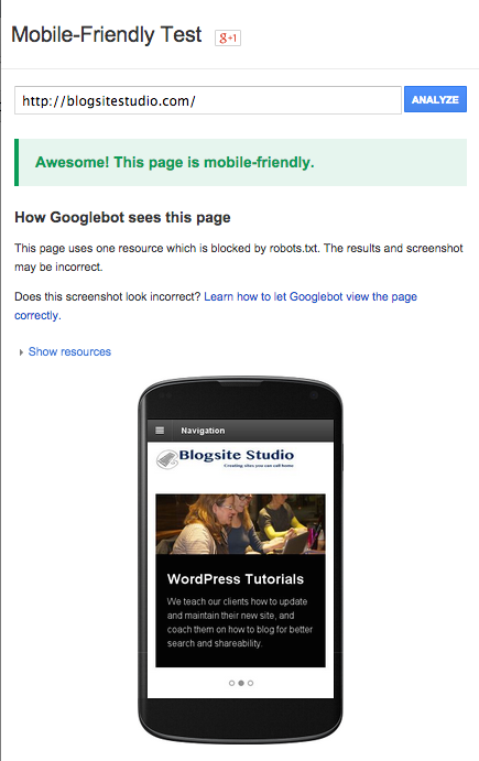
Test with Google’s Mobile-Friendly Test, which might offer suggestions for improvement.
Webmaster Tools: Go to Search Traffic>Mobile Usability to see what errors are found on your site
If you site is discovered to be not mobile friendly, don’t worry. Google won’t count it against you. Just fix it, they say, and then go to Webmaster Tools to Crawl> Fetch as Google to submit your site as Mobile: Smartphone.
Get optimized for smart phones
With WordPress, there are several options to get optimized for devices.
Update your theme
First, check to see if your theme was recently updated with responsive capabilities. If so, just update it.
Install responsive theme
The best way to get your site optimized for smartphones is to switch your theme to a responsive one. It’s that simple.
Responsive themes are programmed to respond to the devices that are calling on them. All the text blocks and widgets line up in one column while retaining their sizes and functions.
Responsive themes were once special, but now they’re common, even for free themes. Like seatbelts in cars, responsive themes have become standard in the industry.
Use a mobile plugin
 If you like the theme you’re using and don’t want to change it, installing a mobile plugin is another option to get your site optimized for smartphones.
Think of the plugin as a theme within a theme. You want to match up two themes and hope they get along, which they don’t always do. Finding the right mobile plugin to use with your theme requires trial and error.
Jetpack has a plugin called Mobile Theme that will, “Optimize your site with a mobile-friendly theme for smartphones.” I’ve found it works ok, sometimes.
WP Touch calls itself, “The trusted mobile solution for WordPress, and automatically enables a simple and elegant mobile theme for mobile visitors of your WordPress website.” I’ve used this plugin successfully and like the way the free version offers a few different theme templates.
WP Mobile Detect is recommended by Google and is touted as being able to differenciate between and smart phone and dumb ones. It also offers 11 themes to choose from.
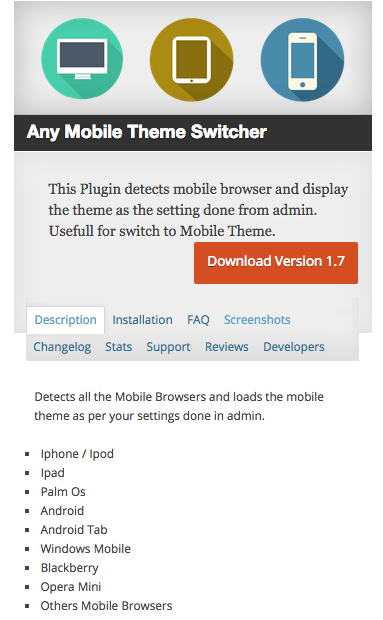
Any Mobile Theme Switcher is a plugin I’ve used successfully. It configures to eight devices and offers 24 different themes, including such well-known themes as Atuhualpa, Canvas, Empire, Inspire, Lightword, as well as all the twenty-something themes from WordPress.
Customizing
If you are an advanced user, Google provides lots of guidance on how to customize your site to make it optimized for smartphones.
Here are some general FAQs.
Use Dynamic Serving
Use Separate URLs
Have fun with all that!
Mobile sins
There are a number of sins committed in the pursuit of mobile friendliness that Google warns against, among them:
- Blocked JavaScript, CSS and image files
- Unplayable content
- Faulty redirects
- Mobile-only 404s
- Irrelevant cross-links
- Slow mobile pages
Avoid these issues at all costs!
And of course, don’t forget to optimize for tablets, which may be losing market share, but are still relevant.
Go forth and mobilize
With all things, change is hard, but it’s the only constant in life other than death and taxes. If we want to play the Internet game, we have to play by the rules of Google the Almighty, whose word will be done.
So get back to your site and make it optimized for smartphones.
BONUS TRACKS!
I attended the Vancouver Web Design Meetup on May 13, and it was all about Mobilegeddon. The program featured Richard Nosek, Director of Digital Marketing at Graphically Speaking: Jason Joo, a senior Web Designer with Graphically Speaking; and Eoin O’Dwyer, senior front-end developer with Graphically Speaking.
Their upshoot was: don’t panic!
You can listen to the program here. For some reason, WordPress is not allowing me to upload a 20 mb Mp3 file, so I broke it down to 3 smaller files. Enjoy!
Richard Nosek
Jason Joo
Eoin O’Dwyer